A systemic therapy practice in need of a rebrand
CECAF’s identity is rooted in Systemic Therapy, an approach that views individuals as part of a larger relational system rather than in isolation.
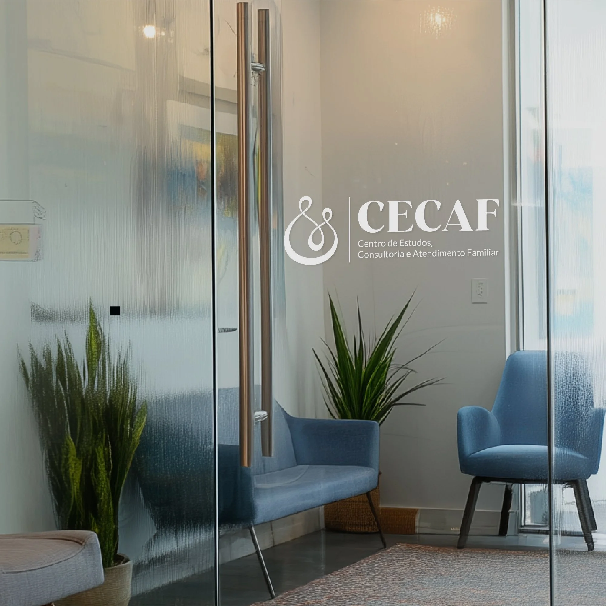
The logo was designed to reflect this perspective, using interconnected forms to represent the relationships and dynamics that shape a person’s experience.
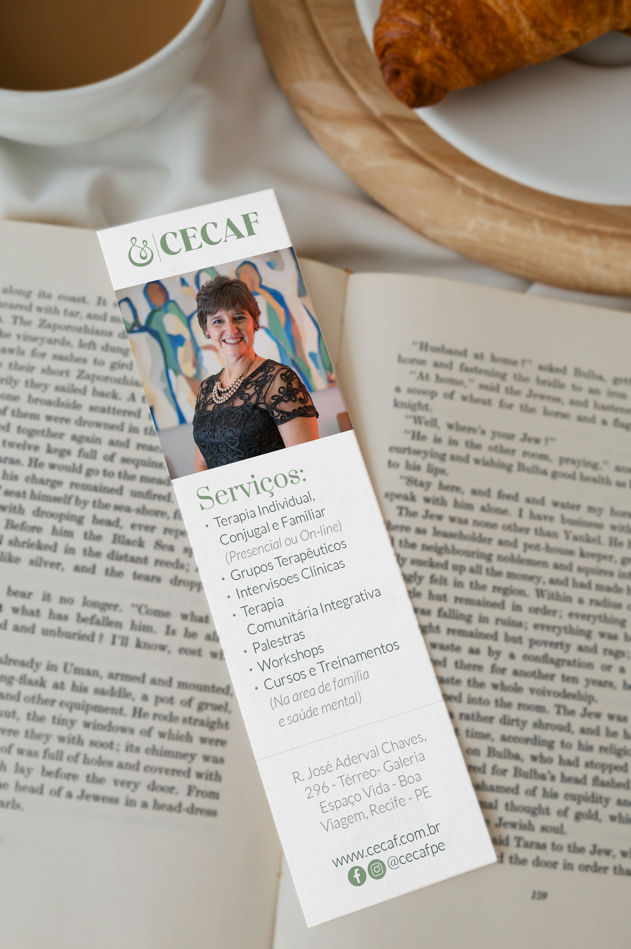
- Brand Identity Design
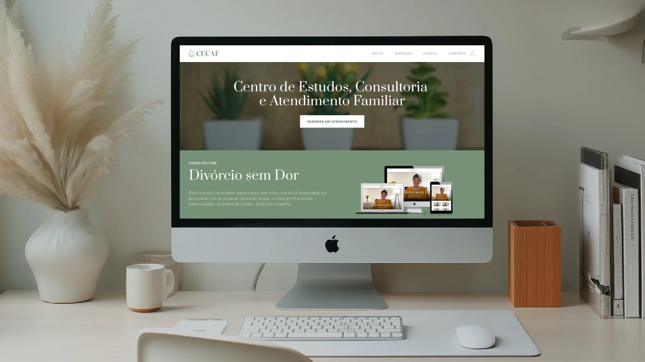
- Website Design
- Social Media Graphics
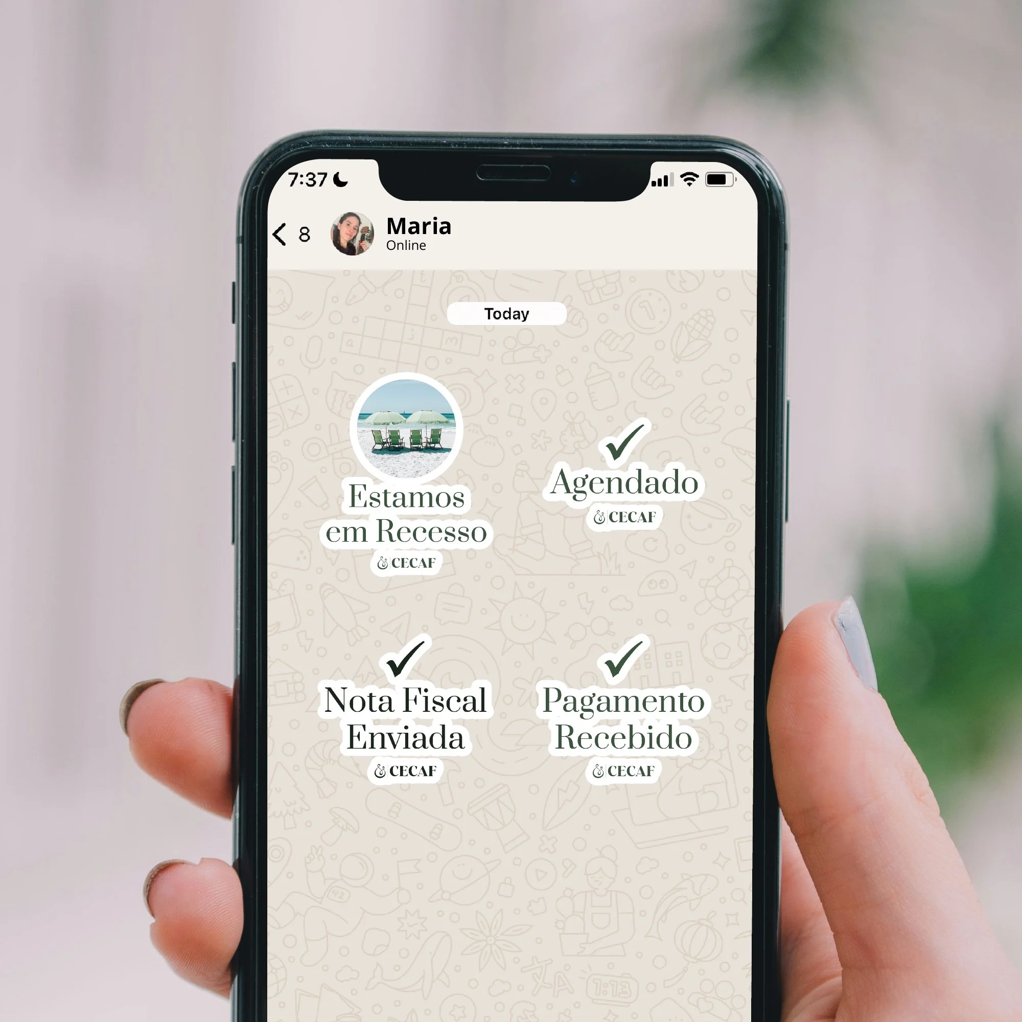
- Whatsapp Stickers
- Animations
- Video Editing
1 The Difference
CECAF approaches therapy through a systemic lens, looking beyond the individual to the relationships and environments that shape their experience.
systemic therapy: viewing people as part of an interconnected system
2 The Concept
I translated this idea of interconnectedness into a gender-neutral logo, using overlapping forms to represent how individuals are part of a larger system.
brand adjectives: warm, professional, approachable
Initial logo concepts

succeeds in being
gender neutral
way too generic

liking these interconnected shapes
the organic shapes are competing though


this clean variation looks best
needs more body to feel balanced
3 The Final Logo